Page 1 of 4
[No longer available] Old graphics
Posted: Wed Mar 21, 2018 1:24 pm
by Deadlock989
These graphics were from an overhaul mod project that I've now abandoned resumed.
Re: WIP: Deadlock's Industrial Revolution (image heavy)
Posted: Wed Mar 21, 2018 1:24 pm
by Deadlock989
[reserved]
Re: WIP: Deadlock's Industrial Revolution (image heavy)
Posted: Thu Mar 22, 2018 7:24 pm
by Deadlock989
[removed]
Re: WIP: Deadlock's Industrial Revolution (image heavy)
Posted: Sun Mar 25, 2018 9:56 am
by Deadlock989
[removed]
Re: WIP: Deadlock's Industrial Revolution (image heavy)
Posted: Sun Mar 25, 2018 10:30 am
by orzelek
Smallish question:
Would you consider releasing those nice belt graphics in separate mod?
Preferably with bob's compatibility from the start

I'm also looking forward to see the total conversion

Re: WIP: Deadlock's Industrial Revolution (image heavy)
Posted: Sun Mar 25, 2018 10:35 am
by Deadlock989
orzelek wrote:Smallish question:
Would you consider releasing those nice belt graphics in separate mod?
Preferably with bob's compatibility from the start
I'm also looking forward to see the total conversion
A slightly different version of the belt graphics (same thing but always a grey background, some of the DIR belts are bronze-coloured) is available now in Compact Loaders:
https://mods.factorio.com/mod/DeadlockLoaders. You can't turn the loaders off unfortunately, I could add that if it was wanted.
I will need to hit you up, orzelek, for RSO support at some point ...
Re: WIP: Deadlock's Industrial Revolution (image heavy)
Posted: Sun Mar 25, 2018 10:39 am
by orzelek
Deadlock989 wrote:orzelek wrote:Smallish question:
Would you consider releasing those nice belt graphics in separate mod?
Preferably with bob's compatibility from the start
I'm also looking forward to see the total conversion
A slightly different version of the belt graphics (same thing but always a grey background, some of the DIR belts are bronze-coloured) is available now in Compact Loaders:
https://mods.factorio.com/mod/DeadlockLoaders. You can't turn the loaders off unfortunately, I could add that if it was wanted.
I will need to hit you up, orzelek, for RSO support at some point ...
I was reading in order so found the compact loaders later
As for RSO support - take a look at vanilla.lua in resourceconfigs folder. It has some explanations about generation parameters. Let me know if you have more questions. If you can prepare the config file I'll add it to RSO.
Re: WIP: Deadlock's Industrial Revolution (image heavy)
Posted: Mon Mar 26, 2018 4:13 pm
by Deadlock989
[removed]
Re: WIP: Deadlock's Industrial Revolution (image heavy)
Posted: Tue Mar 27, 2018 10:54 pm
by Deadlock989
[removed]
Re: WIP: Deadlock's Industrial Revolution (image heavy)
Posted: Thu Mar 29, 2018 10:22 am
by Deadlock989
[removed]
Re: WIP: Deadlock's Industrial Revolution (image heavy)
Posted: Thu Mar 29, 2018 11:58 am
by fiery_salmon
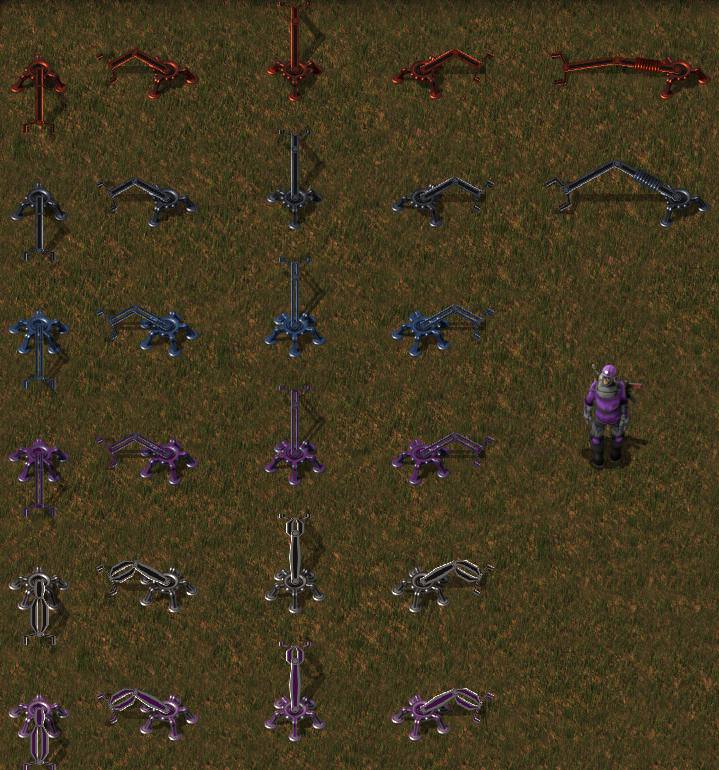
Deadlock989 wrote:Prototype burner miners and burner inserters. Not happy with the inserters. Built the miners to have the "furnace glow" - I wanted that for all burner machines - but turns out that some entity types can't have working visualisations so the furnace would "freeze" when the machine stops. So that had to go.
Have you tried requesting mod support for that (or is it already requested and rejected)?
Re: WIP: Deadlock's Industrial Revolution (image heavy)
Posted: Thu Mar 29, 2018 4:50 pm
by Deadlock989
[removed]
Re: WIP: Deadlock's Industrial Revolution (image heavy)
Posted: Fri Mar 30, 2018 12:56 pm
by Deadlock989
[removed]
Re: WIP: Deadlock's Industrial Revolution (image heavy)
Posted: Fri Mar 30, 2018 1:07 pm
by morfledouille
Deadlock989 wrote:Second pass on inserters. Same scheme as vanilla with an added long burner inserter. Better, but not chunky enough and I don't really like the blue and purple for the fast and filter versions. How to differentiate them otherwise?
Maybe by having two different colours? For example one for the arm to indicate tier and one for base for type (long, filter, stack)?
It all looks great by the way. Looking forward to it!
Re: WIP: Deadlock's Industrial Revolution (image heavy)
Posted: Fri Mar 30, 2018 1:12 pm
by Deadlock989
morfledouille wrote:Maybe by having two different colours? For example one for the arm to indicate tier and one for base for type (long, filter, stack)?
It all looks great by the way. Looking forward to it!
Thanks. And that's definitely an option.
Options:
1. Kill filter inserters. Make all electric inserters have filters. In the new tech tree you can't build them until you've researched Electronics anyway, so they're already unlocked at the same time. (Edited to add: no, won't work, too finicky setting up default filters).
2. Kill fast inserters. Make electric inserters just intrinsically better than burner. I gather lots of people never use a yellow inserter once blue are available anyway. Also, loaders are available, so do we need loads of different speeds to take things off belts?
3. Don't colour them, use only the base metal colours (copper, iron, steel), but make their designs instantly recognisable. A red Borg laser on the head of the filters? Wings on the base of the fast inserter?
4. As morfledouille suggests, only colour the base. (Edited to add: stack inserters are currently tier 4 because they have advanced electronics in them. If they were tier 5, stack inserters could have gold plated bling - iron is only a few shades darker/bluer than steel so the contrast isn't great).
5. Good enough, get on with other stuff.
Re: WIP: Deadlock's Industrial Revolution (image heavy)
Posted: Fri Mar 30, 2018 5:24 pm
by Deadlock989
[removed]
Re: WIP: Deadlock's Industrial Revolution (image heavy)
Posted: Sat Mar 31, 2018 4:48 pm
by dood
Don't go too crazy on the contrast.
Pronze and iron just look dreary and could maybe use a coat of paint and those white inserters have whites and blacks right next to each other all over them, it makes the whole thing look busy and hard to recognize.
Their design also looks very fragile because of those tapered supports near their joints.
The weight of the much wider arm would just make it snap off on the thin base joint which doesn't communicate very will that this is, I presume, the highest tier, largest volume inserter.
Maybe go for more chunk and some white plates on them to make them look beefy.
If something tapers, it should probably do so uniformly towards the head to suggest a stable, triangular shape.
Those spools on the long-handed inserters suffer from the same problem, it looks very heavy in the middle and dinky on the joints.
Your previous version that went from thick at the base to thin towards the head didn't have this problem.
Nice idea with the red eyes for filter inserters.
Stands out right away and it won't take long for people to make the connection that everything with those red eyes is "looking for something".
Re: WIP: Deadlock's Industrial Revolution (image heavy)
Posted: Sat Mar 31, 2018 9:30 pm
by Deadlock989
It's not easy.
Inserters are unlike any other entity in the game. Only the tripod base works anything like the other entity sprites. The arms themselves are top-down 2D pictures which are squeezed and stretched by the game engine to simulate 3D movement, and modders have no control over how that's done. The lower arm is specified as thinner than the upper.
They have to be distinguishable against a variety of backgrounds from dark brown dirt through various tans and greens up to the very light grey of refined concrete. This doesn't leave a lot of colour choices: you can go rainbow, which is what Wube did, and that works. But I wanted a change: I want factories to look like the "age" they're in, at a glance. So they have to be copper, iron and steel to match the tech tiers. Steel has to be much whiter than it would otherwise be - it can't have proper reflections because this isn't proper 3D, and if it's grey it just looks like iron again. Those stack inserters above are actually white and brown but against a green background and with imgur's high compression it just looks black and white. I tried light grey and medium grey and it just looks washed out. The only other option is gold, but that would lock stack inserters behind tier 5 which seems harsh. I'll do another pass but it probably won't change much.
As for realism and weight-bearing etc., I'm not really bothered. The vanilla inserters all have much thicker upper limbs, stack inserters around triple. If it's good enough for Wube it's good enough for me. This is a game, not a reality simulator. That's why an oil refinery is less than twice the height of a person.
To misquote Terry Pratchett, sometimes things that look like things look more like things than things.
Re: WIP: Deadlock's Industrial Revolution (image heavy)
Posted: Sun Apr 01, 2018 1:16 am
by dood
Here's a horrible edit, hope it helps.
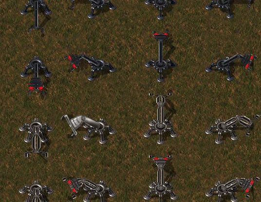
I'm just saying the steel inserters look a bit too busy due to their contrast which is probably the result of you trying to convey "steel" with a steel girder shape that creates harsh shadows and then applying it to a complex, 2 pronged form.
Something a bit softer would improve readability.
Re: WIP: Deadlock's Industrial Revolution (image heavy)
Posted: Sun Apr 01, 2018 9:45 am
by Deadlock989
[removed]