Page 1 of 1
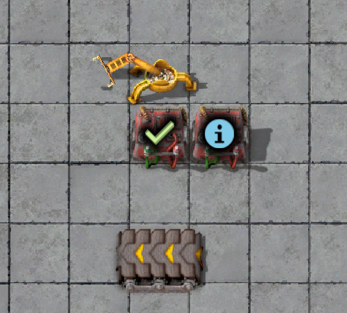
[1.1.6] Check signal icon is blurry on combinators
Posted: Thu Dec 17, 2020 11:45 pm
by Till223
The check signal is blurry and looks like it's displayed two times overlapping each other at certain zoom levels. It makes my head hurt when I look at it.
Reproduce:
Place a constant combinator and select check signal. Zoom in as close as possible, zoom out twice.
Re: [1.1.6] Check signal icon is blurry on combinators
Posted: Tue Jan 05, 2021 5:27 pm
by Rseding91
Looking at the PNG file the checkmark isn't blurry so what ever is happening is most likely related to trilinear filtering and scaling.
I don't know if there's anything to do about it except "leave it as is" or "make a new checkmark with less room for filtering to blur it".
That is; unless I'm completely wrong with my analysis.
Re: [1.1.6] Check signal icon is blurry on combinators
Posted: Tue Jan 05, 2021 5:35 pm
by Rseding91
After talking with one of the graphics guys he decided that we're going to just leave this as is. It's most likely related to linear filtering and or the fact the check mark is a sharp diagonal line which ends up having these kinds of issues.
Re: [1.1.6] Check signal icon is blurry on combinators
Posted: Tue Jan 05, 2021 5:54 pm
by ptx0
Rseding91 wrote: ↑Tue Jan 05, 2021 5:35 pm
After talking with one of the graphics guys he decided that we're going to just leave this as is. It's most likely related to linear filtering and or the fact the check mark is a sharp diagonal line which ends up having these kinds of issues.
you could do a curvy line like a handwritten check mark.