Page 2 of 3
Re: The Electric network infoscreen is counter-intuitive
Posted: Wed Oct 14, 2015 10:42 pm
by Zeblote
ssilk wrote:I dunno why this little detail is discussed here. It's off-topic.

This counter-intuitive screens have been criticized many times. The devs found a provisional solution (making the consumption yellow, when missing power). This helped a lot. For more than 95% of all players this works. But it's clear since 2 years or so, that the info-screen must be rewritten. This is a big complex, because there is the need to implement own displays for modders. And other infoscreens.
Sometimes, anywhere, "when they have time".
And of course this will be fixed then. But until then I want them to invest their time into "more important" things.

It's a very easy fix actually. Just rename "Consumption" to "Available Production" and "Production" to "Current Consumption". Might also want to show actual values (in W) for both, but that's not super important. Then you get the following:
- Available production bar is shorter than consumption if you don't have enough energy.
- Consumption bar is shorter than available production if you do have enough energy.
- The two bars intuitively show the ratio between available production and current consumption, especially to new players.
Additionally, make the available production bar red if missing power.
Now you have a gui that makes sense, without the need to write any new code

Re: The Electric network infoscreen is counter-intuitive
Posted: Thu Oct 15, 2015 1:08 am
by Ranakastrasz
ssilk wrote:I dunno why this little detail is discussed here. It's off-topic.
This counter-intuitive screens have been criticized many times. The devs found a provisional solution (making the consumption yellow, when missing power). This helped a lot. For more than 95% of all players this works. But it's clear since 2 years or so, that the info-screen must be rewritten. This is a big complex, because there is the need to implement own displays for modders. And other infoscreens.
Sometimes, anywhere, "when they have time".
And of course this will be fixed then. But until then I want them to invest their time into "more important" things.
Assuming you mean the label, I would note that despite being a little detail, if named properly, it would be far more obvious what the two bars mean.
That said, an overhaul might be better.
Re: The Electric network infoscreen is counter-intuitive
Posted: Thu Oct 15, 2015 7:08 am
by bobingabout
The bar named production, showing how much of possible production is actually being produced based on demand.... this can be known as Consumption.
The bar named Consumption, shows how well you are providing power based on demand... this can be known as production.
You see where the confusion is? The labels are backwards.
Better lables would help.
Instead of calling it Production, call it...Supply Usage.
Instead of calling it Consmption, call it Demand Satisfaction.
Better names, could possibly do better. "Demand Satisfaction" is a term I actually hear regularly on TV related to the power grid.
Re: The Electric network infoscreen is counter-intuitive
Posted: Thu Oct 15, 2015 7:58 am
by Neotix
bobingabout wrote:Better names, could possibly do better. "Demand Satisfaction" is a term I actually hear regularly on TV related to the power grid.
Yes, it should be renamed and little changed.
When I first played Factorio I was confused (I'm electro-energetic engineer) because of that names. Right now i'm used to it but for new players that knows anything about electricity it can be also confused.
It could work like this:
All machines have power and power plants have some reserves.
Too much machines and power plants are overloaded.
Power plants can't work with 100% efficiency (too low hot water or it's night) and machines don;t have enough power.
Re: The Electric network infoscreen is counter-intuitive
Posted: Thu Oct 15, 2015 10:33 am
by ash1803
LotA: Thanks for the explanation. What you say makes also helps explain why we see a power icon on a steam engine until it is actually connected to something the draws power. I'm starting to get it, but it would be great if they clarified it a bit for newer players.
ssilk: Funnily enough I'm red/green colour blind

so I'm definitely one of the 5%. However I think it might be a bit more than 5% of players that find this a bit confusing from my experience so far.
I don't think the screen needs a rewrite, just add a simplified bar showing a proportional usage of the total production. I have no problems with the existing bars staying, sounds like they are quite useful for experienced players / large builds.
(BTW I can actually see the yellow, green colour changes, I have more problems with small lines of red/green/yellow if they are on white/bright backgrounds, the darker background on this screne is fine for me) .
Re: The Electric network infoscreen is counter-intuitive
Posted: Fri Oct 16, 2015 9:19 am
by CoolGabrijel
I tots agree with this
If the devs can make the game detect the research the player was doing and then displaying it when its done.
It should be easy to change the two words.
(Can I vote topics? I want the devs to see this)
Re: The Electric network infoscreen is counter-intuitive
Posted: Fri Oct 16, 2015 9:23 am
by Zeblote
CoolGabrijel wrote:I tots agree with this
If the devs can make the game detect the research the player was doing and then displaying it when its done.
It should be easy to change the two words.
(Can I vote topics? I want the devs to see this)
Did you post in the wrong topic?
Re: The Electric network infoscreen is counter-intuitive
Posted: Fri Oct 16, 2015 9:35 am
by CoolGabrijel
Zeblote wrote:CoolGabrijel wrote:I tots agree with this
If the devs can make the game detect the research the player was doing and then displaying it when its done.
It should be easy to change the two words.
(Can I vote topics? I want the devs to see this)
Die you post in the wrong topic?
What?
I thought this was the "The Electric network infoscreen is counter-intuitive" topic...
And who is Die? Are you telling me to Die?
I don't get it...
Re: The Electric network infoscreen is counter-intuitive
Posted: Fri Oct 16, 2015 10:22 am
by PiggyWhiskey
CoolGabrijel wrote:Zeblote wrote:CoolGabrijel wrote:I tots agree with this
If the devs can make the game detect the research the player was doing and then displaying it when its done.
It should be easy to change the two words.
(Can I vote topics? I want the devs to see this)
Die you post in the wrong topic?
What?
I thought this was the "The Electric network infoscreen is counter-intuitive" topic...
And who is Die? Are you telling me to Die?
I don't get it...
Firstly, no need to troll. Die could be a misspelling (Did?) or possibly from another language. IIRC it means "The" in German. Not everyone is a native english speaker.
Second, his reaction was an honest one. The Electric Network Information screen has absolutely nothing to do with research. If you have another Suggestion, I suggest you make a new thread for it.
Re: The Electric network infoscreen is counter-intuitive
Posted: Fri Oct 16, 2015 10:39 am
by Zeblote
CoolGabrijel wrote:Zeblote wrote:CoolGabrijel wrote:I tots agree with this
If the devs can make the game detect the research the player was doing and then displaying it when its done.
It should be easy to change the two words.
(Can I vote topics? I want the devs to see this)
Die you post in the wrong topic?
What?
I thought this was the "The Electric network infoscreen is counter-intuitive" topic...
And who is Die? Are you telling me to Die?
I don't get it...
Woops, looks like autocorrect messed up... I'm very sure I wrote 'did'
Re: The Electric network infoscreen is counter-intuitive
Posted: Fri Oct 16, 2015 1:28 pm
by ssilk
Hm, i like Neotix's display ides and I thought what we as players really want is ONE display. I think it should look a bit like this:

Much more analog looking. It matches much better to the Factorio graphic style than any pseudo-digital-display.
Explanation: The red needle (at 4) is for our case the maximum production (available power). The fat black needle (currently at 1) is the current needed consumption.
(I don't want to discuss here, how to label that, that's in my opinion a different theme)
So the fine black needle should be normally equal to the black needle. If that falls below the black, you have a problem: Warning lamps on the bottom of the display can turn on.
There are of course much more to be thought. I think for example to a button, which divides out the displayed amount from/to accumulators. And other things. Many ideas.
But we need also also another display: How long will the current stored electric energy last with the current need for power? How many seconds/minutes? Would be also a cool analog display.
Like here on the left side:

The left side of the instrument is the time until loaded/unloaded (a scale is needed), the right side (0, 3, 5, 10, 50) is the current scale in seconds, minutes or so...
...
I would couple this display also with this idea:
https://forums.factorio.com/forum/vie ... =6&t=16723
It makes total sense to have a very visual feedback on the top of the power-poles, that the energy level is now low (Green/blue = full satisfaction, yellow/orange = not satisfied, red = warning!, black =
)
Re: The Electric network infoscreen is counter-intuitive
Posted: Fri Oct 16, 2015 3:55 pm
by Ghoulish
Thought I would (finally!) Create an account so I could agree with the OP. And to highlight this;
Zeblote wrote:
It's a very easy fix actually. Just rename "Consumption" to "Available Production" and "Production" to "Current Consumption".
This to me seems a very good short term solution, and easy to implement?
ssilk wrote:This counter-intuitive screens have been criticized many times. The devs found a provisional solution (making the consumption yellow, when missing power). This helped a lot. For more than 95% of all players this works. But it's clear since 2 years or so, that the info-screen must be rewritten [...] But until then I want them to invest their time into "more important" things.
Clarification and ease of use is something that seems quite lacking (frankly bad) In a lot of games from smaller developers (I appreciate this is an
alpha game!). This I feel is purely down to how difficult it must be to design and code such elements. However ssilk, I would strongly argue that a games UI should be of high priority as it's the doorway to a users game experience, it's what we use day in and day out, and having to head to a wiki or search outside the game for clarification is never ever a good thing in my most humble opinion. The idea above for a simple renaming seems like a great interim solution with the big revamp somewhere down the line, I do like your idea of flashing lights on pylons to indicate power level usage (assuming the lights were not overly bright or distracting).
Tooltips in this instance would be another possible short term solution? Which could also be easily be applied to the other counter intuitive aspects of the UI's design too - map generator anyone? Just explain what stuff does with tooltips for the idiots (me) Or new players (also me) Out there.
Re: The Electric network infoscreen is counter-intuitive
Posted: Fri Oct 16, 2015 5:41 pm
by Zeblote
Re: The Electric network infoscreen is counter-intuitive
Posted: Fri Oct 16, 2015 5:51 pm
by CoolGabrijel
PiggyWhiskey wrote:CoolGabrijel wrote:Zeblote wrote:CoolGabrijel wrote:I tots agree with this
If the devs can make the game detect the research the player was doing and then displaying it when its done.
It should be easy to change the two words.
(Can I vote topics? I want the devs to see this)
Die you post in the wrong topic?
What?
I thought this was the "The Electric network infoscreen is counter-intuitive" topic...
And who is Die? Are you telling me to Die?
I don't get it...
Firstly, no need to troll. Die could be a misspelling (Did?) or possibly from another language. IIRC it means "The" in German. Not everyone is a native english speaker.
Second, his reaction was an honest one. The Electric Network Information screen has absolutely nothing to do with research. If you have another Suggestion, I suggest you make a new thread for it.
Firstly, I wasn't trolling I was seriously curious what he ment by Die (Which now that I learn't thanks to not you that its a translate error) (Thanks for clearing that up Zeblote)
Secondly, My reaction to him was honest too and CMON I was just trying to bloody agree with a guy -.-
I am loosing faith in this forum rather quickly
Oh and No need to troll I was just asking what he ment ._.
Re: The Electric network infoscreen is counter-intuitive
Posted: Fri Oct 16, 2015 6:02 pm
by CoolGabrijel
Zeblote wrote:CoolGabrijel wrote:Zeblote wrote:CoolGabrijel wrote:I tots agree with this
If the devs can make the game detect the research the player was doing and then displaying it when its done.
It should be easy to change the two words.
(Can I vote topics? I want the devs to see this)
Die you post in the wrong topic?
What?
I thought this was the "The Electric network infoscreen is counter-intuitive" topic...
And who is Die? Are you telling me to Die?
I don't get it...
Woops, looks like autocorrect messed up... I'm very sure I wrote 'did'
Thanks for actually helping me understand what you ment (Unlike that other guy who was trolling me...)
By "If the devs *can make the game* detect the research the player was doing and then desplaying it when its done."
I was refering to another topic (thats implemented)
So if they can do *that* then they can change a few words right?
Re: The Electric network infoscreen is counter-intuitive
Posted: Fri Oct 16, 2015 10:49 pm
by bobingabout
Well, the change is a bit clearer, however the 2 numbers being the same is a bit... pointless. The Available Production one should probably list the total amount available, rather than what is currently being used. Not so easy to fix with a mod.
Re: The Electric network infoscreen is counter-intuitive
Posted: Fri Oct 16, 2015 11:13 pm
by Zeblote
bobingabout wrote:Well, the change is a bit clearer, however the 2 numbers being the same is a bit... pointless. The Available Production one should probably list the total amount available, rather than what is currently being used. Not so easy to fix with a mod.
Maybe not with a mod, but it's a one-liner fix for the devs. Just divide the values currently at the end of a progress bar by the percentage of the other progress bar.
Re: The Electric network infoscreen is counter-intuitive
Posted: Sun Oct 18, 2015 10:46 am
by Ranakastrasz
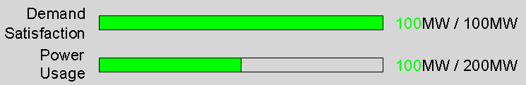
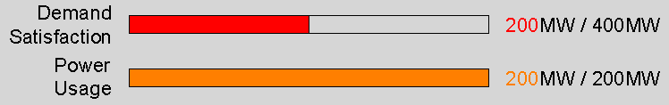
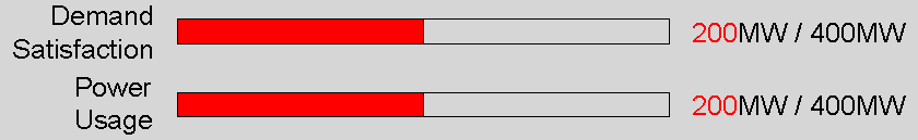
Zeblote wrote:Thanks to the locale system this change is actually incredibly simple. Just look at these images and see how you instantly know what they mean:
--Snip--
Precisely. However, existing players modding this is useless, since they already know, and new players don't think that immediately modding is the solution.
Re: The Electric network infoscreen is counter-intuitive
Posted: Sun Oct 18, 2015 10:50 am
by Zeblote
Ranakastrasz wrote:Zeblote wrote:Thanks to the locale system this change is actually incredibly simple. Just look at these images and see how you instantly know what they mean:
--Snip--
Precisely. However, existing players modding this is useless, since they already know, and new players don't think that immediately modding is the solution.
Players changing this themselves is obviously not the solution. It's something the devs need to do, along with making the values after the progress bar actually useful.
Re: The Electric network infoscreen is counter-intuitive
Posted: Sun Oct 18, 2015 11:16 am
by Ranakastrasz
Zeblote wrote:Ranakastrasz wrote:Zeblote wrote:Thanks to the locale system this change is actually incredibly simple. Just look at these images and see how you instantly know what they mean:
--Snip--
Precisely. However, existing players modding this is useless, since they already know, and new players don't think that immediately modding is the solution.
Players changing this themselves is obviously not the solution. It's something the devs need to do, along with making the values after the progress bar actually useful.
I am pretty sure I just said that.


