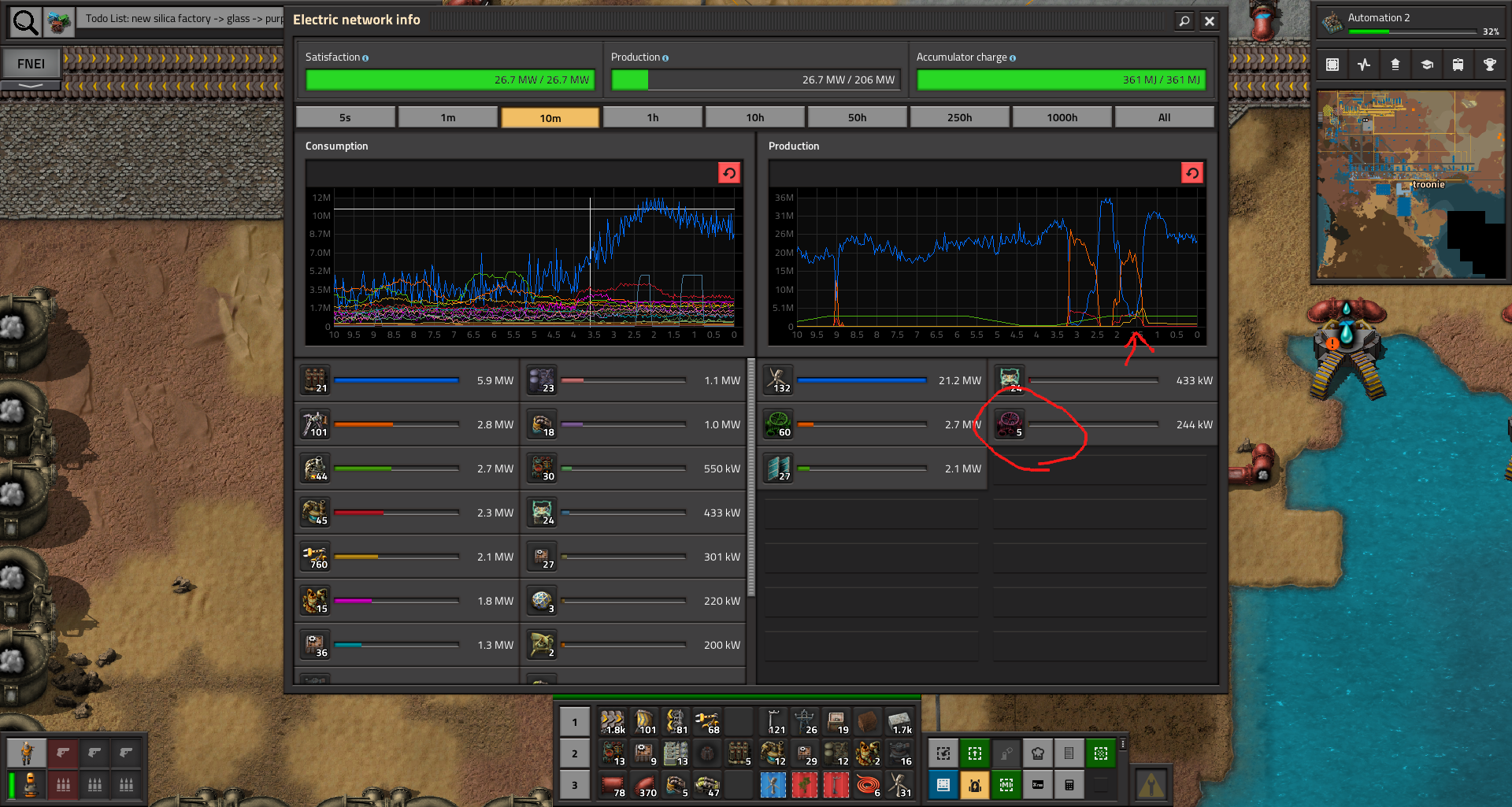
Can you please add a colored square next to the purple generator icon? Either always, or only in the case when the bar is short enough.
Color legend unclear on graphs
Color legend unclear on graphs
Looking at the electricity production graph on the image attached, the purple turbine's graph is plotted with yellow. Yet it's share is too small for the bar below it to show that the yellow graph corresponds to the purple turbine. It's problematic when there are a few of such power sources.
Can you please add a colored square next to the purple generator icon? Either always, or only in the case when the bar is short enough.

Can you please add a colored square next to the purple generator icon? Either always, or only in the case when the bar is short enough.
Re: Color legend unclear on graphs
That's not a bug.

