Hello,
Can anyone create a quick guide/tutorial on how to create gui's? I can't get any further than simple gui's in the top left / center of the screen.
I've tried looking at the advanced logistics mod and the test mode mod but that doesn't make me any wiser. Anyone with more knowledge can tell me how to create gui's like that?
Thanks in advance.
Gui help
Re: Gui help
Well i don't know about creating a tutorial, but i'd gladly help with any specific questions you have.
All in all looking at other mod's code and how they have implemented their GUIs should help alot..
All in all looking at other mod's code and how they have implemented their GUIs should help alot..
Advanced Logistics System - Provides a detailed view of your logistics network and the items within it
Re: Gui help
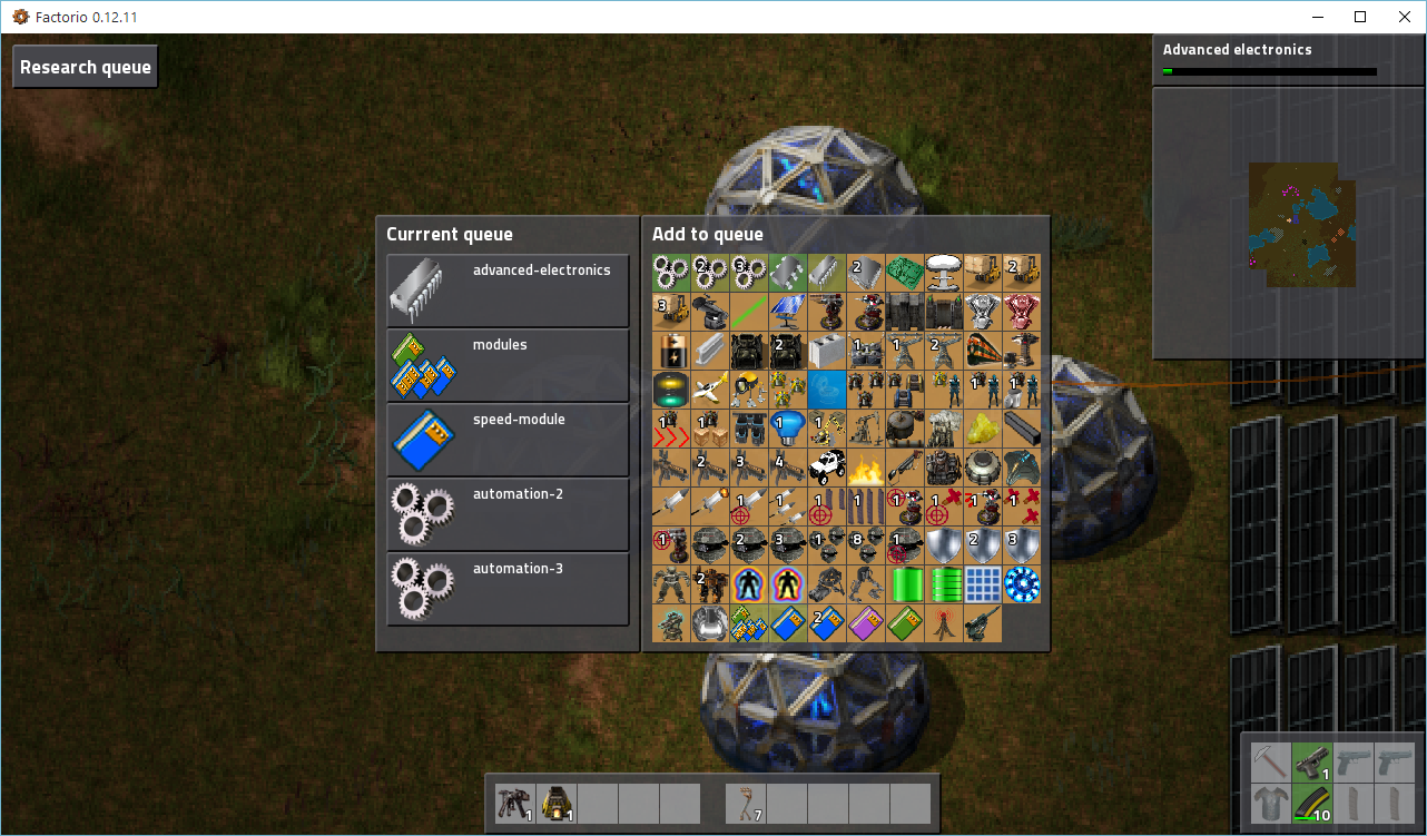
Ok, I've been doing some tinkering, and these are the issues I still have now:
1) some icons are too wide. For some reason icons that don't fill the full 64x64 icon get scaled and I can't stop that.
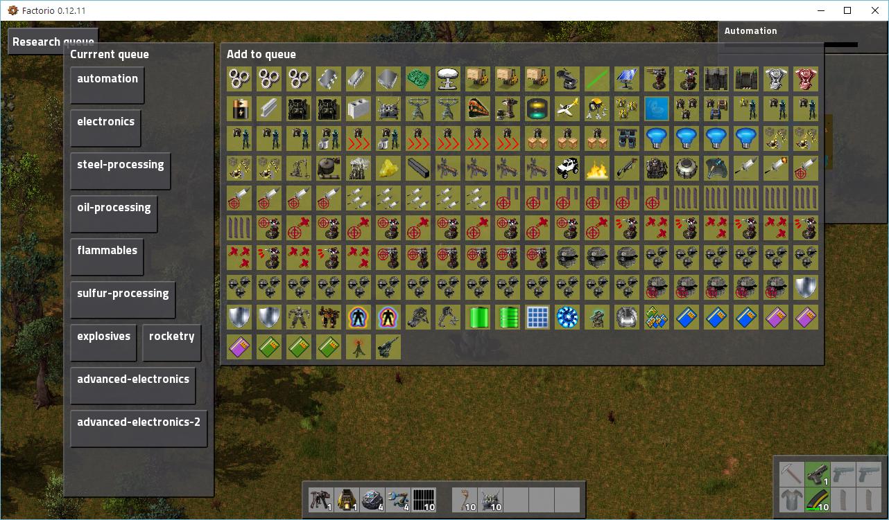
2) Explosives and rocketry are on the same line, I don't want that. Also, I want all those items to have the same size, but minimum_width and maximum_width don't seem to do anything.
3) I can't get rid of the gap between the research queue and the add to queue frames. I also want them to be the same size.
4) Because the frames are on top of the buttons (in the add to queue screen), clicking/hovering the button doesn't do anything, since you are clicking/hovering over the frame. But clicking in the middle of the frame also doesn't fire the on_gui_click event. Perhaps is there another way to create buttons that behave like they do in the technology screen?
1) some icons are too wide. For some reason icons that don't fill the full 64x64 icon get scaled and I can't stop that.
2) Explosives and rocketry are on the same line, I don't want that. Also, I want all those items to have the same size, but minimum_width and maximum_width don't seem to do anything.
3) I can't get rid of the gap between the research queue and the add to queue frames. I also want them to be the same size.
4) Because the frames are on top of the buttons (in the add to queue screen), clicking/hovering the button doesn't do anything, since you are clicking/hovering over the frame. But clicking in the middle of the frame also doesn't fire the on_gui_click event. Perhaps is there another way to create buttons that behave like they do in the technology screen?
Code
Re: Gui help
So you are working on a research queue mod? sounds neatMrDoomah wrote:Ok, I've been doing some tinkering, and these are the issues I still have now:
1) some icons are too wide. For some reason icons that don't fill the full 64x64 icon get scaled and I can't stop that.
2) Explosives and rocketry are on the same line, I don't want that. Also, I want all those items to have the same size, but minimum_width and maximum_width don't seem to do anything.
3) I can't get rid of the gap between the research queue and the add to queue frames. I also want them to be the same size.
4) Because the frames are on top of the buttons (in the add to queue screen), clicking/hovering the button doesn't do anything, since you are clicking/hovering over the frame. But clicking in the middle of the frame also doesn't fire the on_gui_click event. Perhaps is there another way to create buttons that behave like they do in the technology screen?
Code
1- use checkboxes for the icons, buttons seem to always scale and ignore the scaling option in my experience so far.
2- for frames you can use minimal_width and minimal_height and also just width, also you can set a width on labels/buttons to equal to their parent's width to force them in one line each, a better approach here is to use a vertical frame as parent and wrap each item on its own flow, and enforce the same width on the flow itself, that way you can stack several gui elements per line rather than just one button/label ect..
3- make sure you don't have any paddings on a hidden frame/invisible frame, also if you have a flow somewhere make sure it's horizontal_spacing is 0, to make them the same size you can just set the width/height for each frame to be equal.
4- just add the button inside the frame not the other way around?
anyway most of the issues seem to be style related, i will have a closer look and hopefully post some modified code if i have time today.
Advanced Logistics System - Provides a detailed view of your logistics network and the items within it
Re: Gui help
1) They were frames acutally, but buttons and checkboxes also ignore scaling as far as I see.Outsider wrote:
So you are working on a research queue mod? sounds neat
1- use checkboxes for the icons, buttons seem to always scale and ignore the scaling option in my experience so far.
2- for frames you can use minimal_width and minimal_height and also just width, also you can set a width on labels/buttons to equal to their parent's width to force them in one line each, a better approach here is to use a vertical frame as parent and wrap each item on its own flow, and enforce the same width on the flow itself, that way you can stack several gui elements per line rather than just one button/label ect..
3- make sure you don't have any paddings on a hidden frame/invisible frame, also if you have a flow somewhere make sure it's horizontal_spacing is 0, to make them the same size you can just set the width/height for each frame to be equal.
4- just add the button inside the frame not the other way around?
anyway most of the issues seem to be style related, i will have a closer look and hopefully post some modified code if i have time today.
2) Yep, you're right. By using a flow I got more control over the position and padding/size of the elements. This also solved 3)
(EDIT) The thing I did wrong was that I failed to realise that padding is the space between the border of the (parent-)element and the (child-)elements inside, while flow controls the space between the (child-)elements inside the (parent-)element
4) This causes the background colour to be on top of everything. So each icon gets a green/yellow/orange fade on top of it. But I fixed it by placing an extra transparent button on top of the background and icon frame.
Anyway, it actually start looking good now: