Friday Facts #195 - Poles re-design
Re: Friday Facts #195 - Poles re-design
seems like everyone is so focused on what is being ported to HR that they're ignoring the elephant in the room: when is your main character being ported ?
Re: Friday Facts #195 - Poles re-design
viewtopic.php?f=5&t=44864dasiro wrote:seems like everyone is so focused on what is being ported to HR that they're ignoring the elephant in the room: when is your main character being ported ?
"--? How are commands compounded in a compounded compound command commanding compound composts." -defines.lua
-
meganothing
- Filter Inserter

- Posts: 264
- Joined: Thu Sep 15, 2016 3:04 pm
- Contact:
Re: Friday Facts #195 - Poles re-design
Another vote to mostly keep medium pole with the old slanted design (even though medium pole v2.b isn't bad). I also like the coppery color of the old top. What should be improved is the size of the old top which always seemed too massive, top-heavy.
What I also would question is the need for a 45 degree rotation (for all poles). Even in the original designs the rotated poles looked suboptimal and the same difficulties seem to come up in the new designs. Even with only diagonal power lines connected to the poles everything looks better with the unrotated poles (at least I thought so while trying to ignore the additional line I put in to keep the poles unrotated in my test game right now ).
).
If the rotation is because of circuit network lines that might overlap too much with the power lines, make a design where the connectors are not in a straight line even on the unrotated pole and the lines should be well apart again.
Small pole looks good (unrotated). Big pole could use bigger more visible ceramic insulator thingies, it looks a bit empty and has the biggest problem with the rotated design.
What I also would question is the need for a 45 degree rotation (for all poles). Even in the original designs the rotated poles looked suboptimal and the same difficulties seem to come up in the new designs. Even with only diagonal power lines connected to the poles everything looks better with the unrotated poles (at least I thought so while trying to ignore the additional line I put in to keep the poles unrotated in my test game right now
If the rotation is because of circuit network lines that might overlap too much with the power lines, make a design where the connectors are not in a straight line even on the unrotated pole and the lines should be well apart again.
Small pole looks good (unrotated). Big pole could use bigger more visible ceramic insulator thingies, it looks a bit empty and has the biggest problem with the rotated design.
Last edited by meganothing on Sun Jun 18, 2017 12:26 pm, edited 1 time in total.
Re: Friday Facts #195 - Poles re-design
Same here. I think that one is just too unique to change too much at this point.meganothing wrote:Another vote to keep medium pole with the old slanted design (even though medium pole v2.b isn't bad). I also like the coppery color of the old top. What should be improved is the sze of the old top which always seemed too massive, top-heavy.
Also I think, as someone last page mentioned, that the small poles should properly be all wood and would probably work best using a traditional wooden power pole design. No real opinions on the big poles though. I think v2.a looks best but as was pointed out, it looks like it should only be 1x1. Perhaps the 2x2 vs 1x1 concern should be overlooked? Even if it's shrunk to a 1x1 size it's not like people are goign to suddenly start using medium power poles everywhere since they have such a tiny power range.
Re: Friday Facts #195 - Poles re-design
I love that you're doing work on the power poles but the new versions do look rather bland. They need a lot more grunge and a bit more wonkiness to give them character. The suggested versions for big and medium poles are very similar to each other with the straight clean poles.
I love the old big pylon with the circular shape at the top and I know that these exist in reality, so I don't see any reason to go away from that in favor of a boring cross bar. Maybe an alternative would be something like a trident?
Of course the old slanted medium pole made no sense but they are very recognizable and have a great quirky kind of character, sort of steam punk-ish. The new one is just way too "practical". Maybe a good compromise would be to have some kind of "object" attached halfway along the height of the pole? Like a fuse box or a transformer, sort of a tiny version of the base of the old large area power pole.
OS: Linux Mint 19 x64 | desktop: Awesome 4.2 | Intel Core i5 8600k | 16GB DDR4 | NVidia GTX 1050 Ti (driver version: 410.104) (2019-03)
- Killcreek2
- Long Handed Inserter

- Posts: 73
- Joined: Sat Dec 10, 2016 8:39 am
- Contact:
Re: Friday Facts #195 - Poles re-design
Ok, have to admit that I don't really like the proposed big & medium pole designs very much:
Big pole: 2a is pretty bad, 2b is not much better. Rather dull & boring shapes overall though [#see below]. The "T-bar" or "hammerhead" top is much less distinctive than the old "sideways D" upper section. Especially if you also use a T-bar for the copy-cat medium poles...
Medium pole: The new ideas are frankly poor, like a miniature version of a big pole, & with far far far too many boring metal struts [#see below]. I would scrap this design entirely and redo this pole from scratch. Sorry to say, but this one is actually much worse than the existing wonky-but-iconic design.
<edit> Why not use a triangle shaped base with 3 risers, instead of a square base with 4 risers? This would be visually distinct from the big poles. Something like this.
Small pole: Much better than the other two, but the top crossbar should be wood not metal, & there no need for a "metal boot" on the bottom [they are embedded into the ground IRL, not bolted onto the floor via a flange as this "metal boot" suggests]. Also it is far too yellow: wooden poles are sun-bleached grey, or creosote-stained brown / black IRL.
[#] One issue common to these designs: The structural bracing struts are very precise, uniform, & perfectly geometrical in arrangement, which looks BORING. & this also results in confused visuals, as ribsngibs points out earlier.
But, this is Factorio: Dirty, scrappy, thrown-together designs are a hallmark. So make the support struts inside the poles a bit irregular or haphazard instead of the Perfect Geometry! It might also make rotating them easier & more distinctive to the player, and achieve that Factorio-ish "rushed engineering" look.
Last edited by Killcreek2 on Sat Jun 17, 2017 4:22 pm, edited 2 times in total.
"Functional simplicity, structural complexity." ~ Appleseed
Re: Friday Facts #195 - Poles re-design
I mostly like the old designs. The diagonal part of medium pole v1 not really logical, but quite interesting.
Big pole v2.a looks not good. The top is okay, but the pole itself is bad. For a big power pole the base is not wide enough. There are also too many diagonal struts in the design.
medium pole v2.a is pretty ok.
medium pole v2.b looks horrible, there's no other way to say that. Like an over-dimensioned bottle opener. First I would suggest to join the two struts below the top between the connections points of cables and not on the outside. Then this two struts should have a more fluid connection with the base pole. The pole is not "transparent" at all. It's a solid block of metal. There may be small gaps inside there, but you can't really see them.
Why is the top inclined? I don't know if that's good or bad, but I have no idea why that was made so. ^^
small pole v2.a also looks not good. The old brown was much better, and the darker effect at the top and bottom are really weird, much too strong. Why does that even exist?
According to the shadow the top isn't even directly attached to the pole, but with an additional strut. Um, why? I'm no electrician, but I don't see any reason for that at all and that makes the pole much more complex than needed for a "basic" small pole.
Re: Friday Facts #195 - Poles re-design
Can You add a little red, blinking light on top of metal poles?
It would indicate if there is a power connected to that pole (easier finding missing wires), and also help avoid hitting it in the night.
It would indicate if there is a power connected to that pole (easier finding missing wires), and also help avoid hitting it in the night.
- brunzenstein
- Smart Inserter

- Posts: 1112
- Joined: Tue Mar 01, 2016 2:27 pm
- Contact:
Re: Friday Facts #195 - Poles re-design
Great idea!mp0011 wrote:Can You add a little red, blinking light on top of metal poles?
It would indicate if there is a power connected to that pole (easier finding missing wires), and also help avoid hitting it in the night.
Re: Friday Facts #195 - Poles re-design
I'm pretty sure that would pollute the screen given the sheer amount of poles you set up.
"--? How are commands compounded in a compounded compound command commanding compound composts." -defines.lua
Re: Friday Facts #195 - Poles re-design
IMO the old diagonal electric pole looks best if I compare it with the new looks. The new ones seem too perfect.
With factorio I feel that I'm building with lots of "ducktape" (since we're stranded in a new planet and we don't have available "precision" tools) so the theme matches quite right.
The new ones, as I said, are too perfect, I think that they need more dirt and more ducktape.
Just my 2cents
With factorio I feel that I'm building with lots of "ducktape" (since we're stranded in a new planet and we don't have available "precision" tools) so the theme matches quite right.
The new ones, as I said, are too perfect, I think that they need more dirt and more ducktape.
Just my 2cents
Re: Friday Facts #195 - Poles re-design
it would be nice if the collision box for the substation was reduced while you're at it, so annoying not to be able to walk between it and factories
Re: Friday Facts #195 - Poles re-design
Glad I'm not the only one! (see my comment at the end of the previous page).nakran wrote:IMO the old diagonal electric pole looks best if I compare it with the new looks. The new ones seem too perfect.
With factorio I feel that I'm building with lots of "ducktape" (since we're stranded in a new planet and we don't have available "precision" tools) so the theme matches quite right.
The new ones, as I said, are too perfect, I think that they need more dirt and more ducktape.
Just my 2cents
"--? How are commands compounded in a compounded compound command commanding compound composts." -defines.lua
-
MooseyFate
- Manual Inserter

- Posts: 1
- Joined: Sat Jun 17, 2017 7:52 pm
- Contact:
Re: Friday Facts #195 - Poles re-design
I know people are resistant to change, but the big thing to me is that they have personality. That sounds so stupid to say about something as boring as poles, but somehow, the originals had it as much as I can imagine poles having it. I would not sacrifice that personality for poles, but it's a challenge to redesign them and maintain that level of personality. Please only redesign them if that level of personality can be maintained.
CONFUSING GEOMETRY:
As a side note, "horizontal view"? What??? There's a head on/90 degrees/straight view, and an diagonal/45 degree/angle view. Both vertical. So I'll use terms I understand. Not a big deal, but not going to refer to a vertical pole as horizontal. OK, to the point...
I think some of these models make it hard to tell what's going on shape wise. Being able to identify the 3d shape from all angles is second only to personality. Medium pole v.2b has this a little. I can tell whats going on, and the "What kind of engineer does a pole like that?" of the top is appreciated, but in this case is unfortunately awkward to look at. Large pole 3d shape is clear. Small pole 3d shape is the worst. The only instance I can tell what's going on is the shadow of the angled view. I think it's a cool shape, but if you can only make it out in 1 views shadow, it's not working.
RECOMMENDATIONS: #1: prioritize visual personality. So far liking v.1 of all most, v.2b second most, then v.2a. For all of them, the new almost light bulb wire connectors are nice.
Large Pole: if still a 2x2 base, make the base of the pole dramatically wider than the top. Use more metal bar width variation.
Medium Pole: Sorry, the diagonal works. Love that. Also love the copper top. Maybe the copper top make it look less busy though. So stand alone I love it, but you may have a point in removing it. I wouldn't know without using it. Also the diagonal works well with the top branching off from one side a lot more than the angled triangle. v.2b of medium needs the most work.
Small Pole: This is close. While I like what the v.2b angle view shadow is doing, it seems like the starter pole should be the least elaborate. So maybe make the top a simple T bar, or straight sideways from one side (especially if the medium pole does an exaggerated version of this, to give the player an "oh, I see how the poles evolved" feel once upgrading. I'd also opt for the original wood color (unless it's just difference in pic/game coloration, but looks too yellow/orange relative to old pole).
Enjoy the party today! I only bother with these comments because of how amazing you all are.
Absolutely agree. Not bothered by it, but if it was less intrusive and changed to the way it is now, it would be annoying.The main problem with medium and small poles, is that they are normally located in the middle of your factory, so if you have a tight setup they can be very intrusive.
I like that there are some elements of Factorio that have just a little of that "What kind of engineer does a pole like that?" quality to them. The reactor and centrifuge being to glaring examples, but also some of my favorite models in the game. Absolutely disagree.But to be honest I find a bit annoying the absurdity of having a diagonal pole that requires another support on the base just to be stable. What kind of engineer does a pole like that?
This should be the mantra for all visual design in Factorio. It should overrule either of the above two points.The good part of the v.1 is that it is very unique, and you can recognize this pole as from Factorio anytime you see it.
CONFUSING GEOMETRY:
As a side note, "horizontal view"? What??? There's a head on/90 degrees/straight view, and an diagonal/45 degree/angle view. Both vertical. So I'll use terms I understand. Not a big deal, but not going to refer to a vertical pole as horizontal. OK, to the point...
I think some of these models make it hard to tell what's going on shape wise. Being able to identify the 3d shape from all angles is second only to personality. Medium pole v.2b has this a little. I can tell whats going on, and the "What kind of engineer does a pole like that?" of the top is appreciated, but in this case is unfortunately awkward to look at. Large pole 3d shape is clear. Small pole 3d shape is the worst. The only instance I can tell what's going on is the shadow of the angled view. I think it's a cool shape, but if you can only make it out in 1 views shadow, it's not working.
RECOMMENDATIONS: #1: prioritize visual personality. So far liking v.1 of all most, v.2b second most, then v.2a. For all of them, the new almost light bulb wire connectors are nice.
Large Pole: if still a 2x2 base, make the base of the pole dramatically wider than the top. Use more metal bar width variation.
Medium Pole: Sorry, the diagonal works. Love that. Also love the copper top. Maybe the copper top make it look less busy though. So stand alone I love it, but you may have a point in removing it. I wouldn't know without using it. Also the diagonal works well with the top branching off from one side a lot more than the angled triangle. v.2b of medium needs the most work.
Small Pole: This is close. While I like what the v.2b angle view shadow is doing, it seems like the starter pole should be the least elaborate. So maybe make the top a simple T bar, or straight sideways from one side (especially if the medium pole does an exaggerated version of this, to give the player an "oh, I see how the poles evolved" feel once upgrading. I'd also opt for the original wood color (unless it's just difference in pic/game coloration, but looks too yellow/orange relative to old pole).
Enjoy the party today! I only bother with these comments because of how amazing you all are.
Last edited by MooseyFate on Sat Jun 17, 2017 11:41 pm, edited 1 time in total.
Re: Friday Facts #195 - Poles re-design
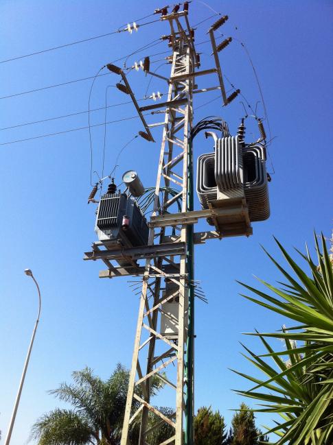
Here some inspiration for you from Israel, Haifa. These poles are ugly as hell IRL but they are perfect for Factorio. Often they have a large concrete foundation in order to protect them from terrorist truck attacks — double perfect for Factorio! They have transformators on them where they branch to homes. You also could implement this feature where the big power pole connects with a smaller one.


Re: Friday Facts #195 - Poles re-design
I would like something like this instead of current blocky substation, it would be too big for power poles imo.hitzu wrote:Here some inspiration for you from Israel, Haifa. These poles are ugly as hell IRL but they are perfect for Factorio. Often they have a large concrete foundation in order to protect them from terrorist truck attacks — double perfect for Factorio! They have transformators on them where they branch to homes. You also could implement this feature where the big power pole connects with a smaller one.
Also, how about concrete power poles and such?


Or something yet different:
Re: Friday Facts #195 - Poles re-design
Avezo wrote: I would like something like this instead of current blocky substation, it would be too big for power poles imo.
Substations are mostly fine IMHO, they should't obstruct too much behind them. And I propose this just as a reference for big power poles, not for direct copying from. I mean power poles from FFF are too symmetric, uniform and suffer from lack of details. These are examples of some beautiful engineering messiness which is ideal for Factorio style.
They're too clean for Factorio for my taste. Probably MK2 Big Power poles for ultra long distances in the late game?Also, how about concrete power poles and such?
Re: Friday Facts #195 - Poles re-design
I can absolutely live with the big power pole. I like the small wooden one a lot, since I really really hate the one currently in the game. But the medium one, I guess I could live with 2a, but 2b, oh dear.
My main problem with power poles is that they look more like radio stations. Lots of metal, little "electric pole"-y stuff like wires, insulators (the big ring shaped things). They are usually tiny in factory like in this real world picture:
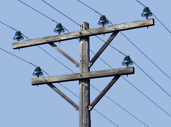
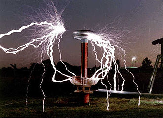
But Factorio is a game and I feel the poles should carry more clarity by being over-the-top electric-styled. Insulators should be MUCH larger and there could even be other gadgets on them (that make absolutely no sense, but make them look more electricity related) - mainly talking about Tesla Coils here.

My main problem with power poles is that they look more like radio stations. Lots of metal, little "electric pole"-y stuff like wires, insulators (the big ring shaped things). They are usually tiny in factory like in this real world picture:

But Factorio is a game and I feel the poles should carry more clarity by being over-the-top electric-styled. Insulators should be MUCH larger and there could even be other gadgets on them (that make absolutely no sense, but make them look more electricity related) - mainly talking about Tesla Coils here.


-
KingIonTrueLove
- Inserter

- Posts: 24
- Joined: Sun Jun 04, 2017 1:38 am
- Contact:
Re: Friday Facts #195 - Poles re-design
I don't usually like to complain about somebody's artwork, but I have to put in my two cents as well: I *hate* the new pole designs. 
I am glad I wasn't the only who who does not like the designs of these new poles. they do not look like 'Factorio' at all.
1: They are way too clean: for instance, almost all the same material is used in the big poles! There was... actual stuff other than just support beams for the previous big pole.
2: The current medium poles are my favorite in the game, the 'why would someone do this' slanted pole is absolutely perfect looking for this game! Sure there might not be any power poles in real life that look like it, but this is a power pole made by a guy who is slowly going crazy being stranded alone with nothing but extreme intelligence, and robots/aliens to talk to.
3: The new design of the small poles is actually not that bad.... except that yellow is incredibly striking. Power poles should not stand out too much in the game, and having something that's too clean or too bright will easily stick out.
4: some of the new designs are too... thin? Especially the big pole. I don't like the idea of having objects that don't use up a good portion of the space they are given, especially because I love making bases look busy and compact.
I am sorry for being so harsh though. But hey, even if I don't like them, its not the end of the world, because Factorio has amazing modding support. So even if it continues on, I can just make a mod that restores the old graphics for those who don't like the change! And If the old ones stay, someone(you?) can make a mod that gives us the option to use the new designs! So in the end its win-win for everybody!
Last edited by KingIonTrueLove on Sun Jun 18, 2017 4:43 am, edited 1 time in total.
Re: Friday Facts #195 - Poles re-design
Any particular reason you can't just update the sprites of the existing power poles? I've been using the medium ones for so long that I instantly recognize the shape... the alternatives you're proposing are, frankly, ugly.
Agreed to everything you said. I'll be one of the first to revert to the old models if they get changed.KingIonTrueLove wrote:I don't usually like to complain about somebody's artwork, but I have to put in my two cents as well: I *hate* the new pole designs.
I am glad I wasn't the only who who does not like the designs of these new poles. they do not look like 'Factorio' at all.
1: They are way too clean: for instance, almost all the same material is used in the big poles! There was... actual stuff other than just support beams for the previous big pole.
2: The current medium poles are my favorite in the game, the 'why would someone do this' slanted pole is absolutely perfect looking for this game! Sure there might not be any power poles in real life that look like it, but this is a power pole made by a guy who is slowly going crazy being stranded alone with nothing but extreme intelligence, and robots/aliens to talk to.
3: The new design of the small poles is bad too.... that yellow is incredibly striking. Power poles should not stand out too much in the game, and having something that's too clean or too bright will easily stick out.
4: some of the new designs are too... thin? Especially the big pole. I don't like the idea of having objects that don't use up a good portion of the space they are given, especially because I love making bases look busy and compact.
I am sorry for being so harsh though. But hey, even if I don't like them, its not the end of the world, because Factorio has amazing modding support. So even if it continues on, I can just make a mod that restores the old graphics for those who don't like the change! And If the old ones stay, someone(you?) can make a mod that gives us the option to use the new designs! So in the end its win-win for everybody!

